UPDATE (10/1/09): The contest is closed to new entries. Scroll down and feast your eyes on some of the incredible submissions we got. the OBJECTIVEHighlight executive compensation (as in, how much CEOs etc. are paid) in an interesting way.the ASSIGNMENTCreate an infographic that explores how much corporate officers in this country are paid. The infographic could compare such data with related figures, like a company's profits, stock price, or the average salary of lower-level workers, or something else altogether. The winning entry will be the one that paints CEO salaries in the most interesting light.the REQUIREMENTSSend us an e-mail at projects[at]goodinc[dot]com with your infographic. It can be in any image format, but it should be high enough resolution that it can be printed at 300 dpi. Make sure to include your sources, and a brief (one or two sentence) introduction to your concept. We'll take submissions now through September 30. The winning entry will be announced on October 2, featured on our homepage, and printed in the next issue of GOOD. We'll send a GOOD T-shirt and a free subscription (or gift subscription) to the winner, along with $250.RESEARCH and INSPIRATIONTake a look at our Transparency archive to see what we've done in the past. You can also check out our Ffffound page, where we curate a selection of infographics from around the web. And if you're looking for some data to get you started, the AFL-CIO keeps tabs on CEO pay, Forbes has this report, you can always check out the Fortune 500 list, and Google Finance is a treasure trove of corporate data.
View full size infographic
 the OBJECTIVEHighlight executive compensation (as in, how much CEOs etc. are paid) in an interesting way.the ASSIGNMENTCreate an infographic that explores how much corporate officers in this country are paid. The infographic could compare such data with related figures, like a company's profits, stock price, or the average salary of lower-level workers, or something else altogether. The winning entry will be the one that paints CEO salaries in the most interesting light.the REQUIREMENTSSend us an e-mail at projects[at]goodinc[dot]com with your infographic. It can be in any image format, but it should be high enough resolution that it can be printed at 300 dpi. Make sure to include your sources, and a brief (one or two sentence) introduction to your concept. We'll take submissions now through September 30. The winning entry will be announced on October 2, featured on our homepage, and printed in the next issue of GOOD. We'll send a GOOD T-shirt and a free subscription (or gift subscription) to the winner, along with $250.RESEARCH and INSPIRATIONTake a look at our Transparency archive to see what we've done in the past. You can also check out our Ffffound page, where we curate a selection of infographics from around the web. And if you're looking for some data to get you started, the AFL-CIO keeps tabs on CEO pay, Forbes has this report, you can always check out the Fortune 500 list, and Google Finance is a treasure trove of corporate data.
Submissions:
From Amanda Buck:View full size infographic
From Katharine Widdows:
View full size infographic From Andrew Janik:View full size infographicFrom Tanner Teale: View full size infographicFrom Dee Adams: View full size infographicFrom Thomas Edwards: View full size infographicFrom Colin Dunn:View full size infographicFrom Robin Richards:View full size infographic From Daniel Burnstein:View full size infographic From Jessica Karle:View full size infographic From Caroline Hadilaksono:View full size infographic Sponsored by the film Capitalism: A Love Story.


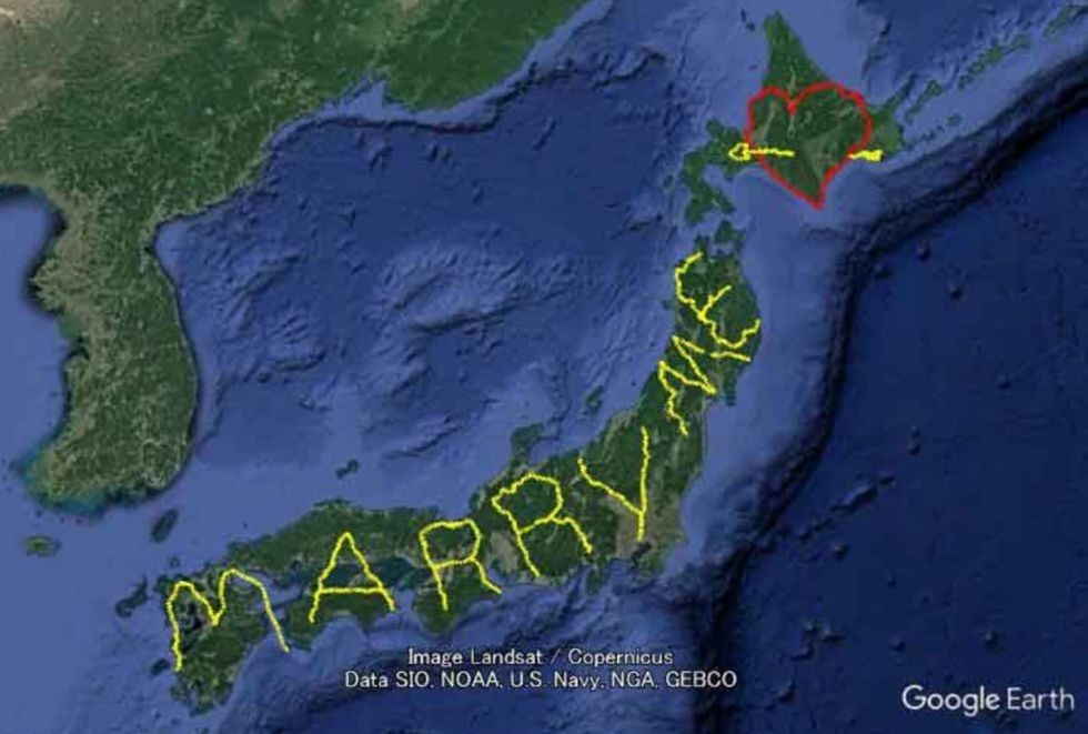
 Yassan's GPS Drawing Project


 Elon Musk poses for a photo op.
 The Atlantic Ocean still holds secrets that scientists are hunting down.
  A detailed map was made using temperature and salinity profiles from the Argo data repository.
 Though you might not be able to tell one bit of water from another, scientists can and there are real consequences for the planet.