


America's farmlands, fields, and ranches are home to over a million hardworking farmers growing food for the nation. Climate, soil quality, and resources vary by region, which affects what crops are produced and where. Recently, Reddit user u/ineptnoob shared an illustrated chart showing where common foods are grown across the U.S. The easy-to-understand graphic quickly attracted the attention of thousands of curious viewers.
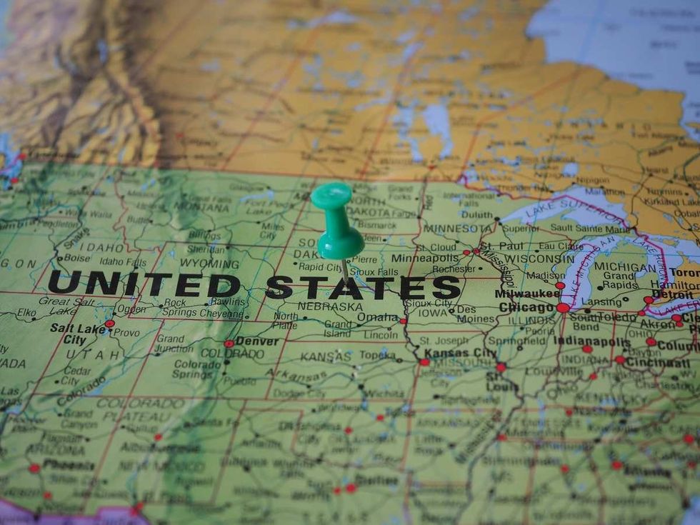 Representative Image Source: Pexels | Beate Vogl
The post includes a visual glossary of maps labeled with different foods. Each map uses a gradient of yellow to green, with yellow representing 1% of production and green showing up to 100%.
Where is usa are common foods grown?
byu/ineptnoob incoolguides
The highlighted areas show the regions in the United States where specific foods are grown. One will typically need to consult a US map to understand this chart.
The chart specifies cropland areas for 32 foods, including apricots, artichokes, carrots, asparagus, blackberries, broccoli, cabbage, corn, chickpeas, cherries, celery, cauliflower, grapes, lemons, lentils, lettuce, onions, oranges, peaches, peanuts, pears, peas, potatoes, pumpkins, rice, soybeans, spinach, squash, sugarcanes, sweet potatoes, tomatoes, and wheat.
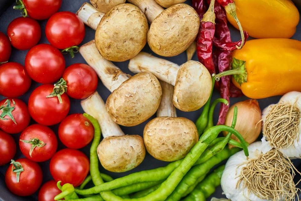 Representative Image Source: Pexels | Engina Kyurt
In the comments section, people are giving a shout-out to California as it appears in 14 out of 32 maps in the given chart, meaning that it produces a large portion of the food that Americans consume. The Golden State is the state that feeds America. This is a correct estimate according to statistical figures too. According to California Grown, California grows 99% of the commercially produced crops in the United States and is the largest producer of vegetables in the country. California leads the nation in agricultural production.
The reason, according to Farm Together, is its climate. California’s climate is well-suited for growing a large variety of crops. The state is one of the only five regions located within a Mediterranean climate zone. These regions are located between 31 and 40 degrees latitude north and south of the equator and include Chile, South Africa, Australia, and the Mediterranean. This position ensures that crops receive ample sunlight for most of the year. This kind of Mediterranean climate is especially favorable for growing crops like tree nuts, stone fruits, and citrus fruits. Therefore, at present, California accounts for $14 billion in crop sales annually and over 28% of the total value of the state’s agricultural sector.
Apart from California being the top agricultural producer, the chart in the post reveals several interesting insights. For example, household crops like wheat, potatoes, and corn are produced by a large number of states, whereas sugarcane is solely produced by Florida, Louisiana, and Texas. Lemons are produced by just California and Arizona, whereas, apricots are by Washington and California. Artichokes are rare and produced only in California, while blackberries are produced only in Oregon. Only California and Arizona are shown to grow broccoli.
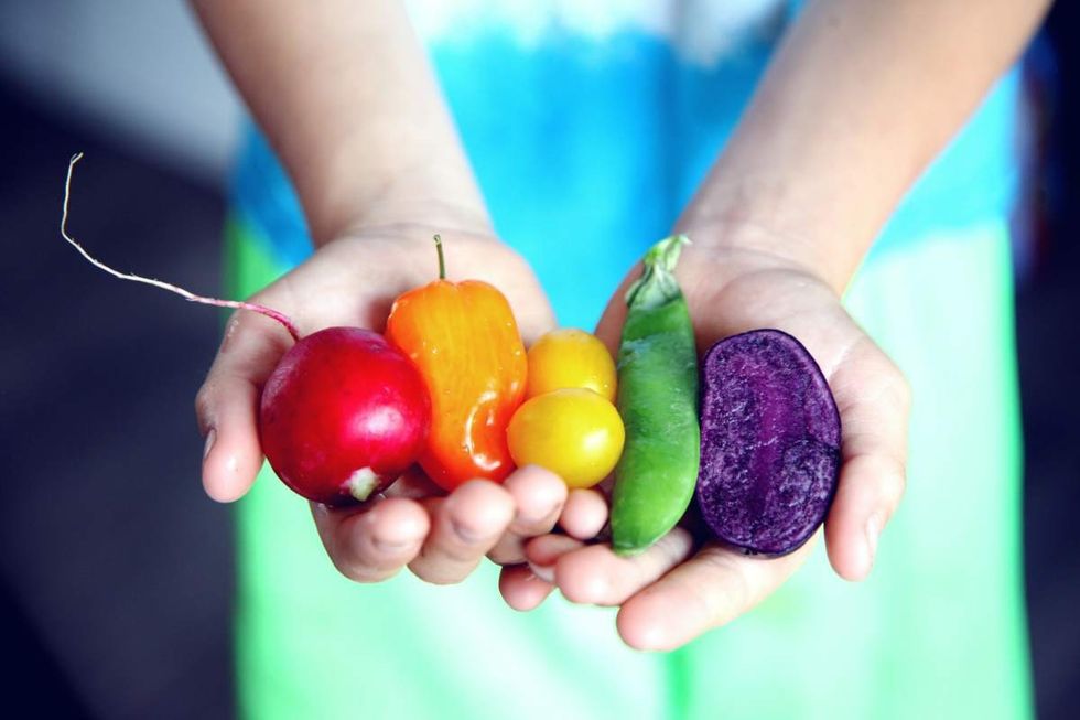 Representative Image Source: Pexels | MC Cutcheon
Originally, this chart was posted by a Redditor, whose account no longer exists, in the group r/Maps in December 2020. When the chart was circulated across social media, people commented that they also wanted to see croplands for some other foods as well. So, sometime later, the person in question edited the chart and recreated a new, larger version adding some fruits and nuts to the list, including apples, watermelon, honeydew, walnuts, cranberries, and strawberries. The latest chart is available to be viewed on Imgur.


 Pexels | Photo by Andrea Piacquadio
 An Atlantic grey seal looking at the camera underwater. (Representative Image Source: Getty Images | Mark Chivers)
 A grey seal swims up to a scuba diver. (Representative Image Source: Getty Images | Huw Thomas)
 A Grey seal nibbles at the hood of a scuba diver. (Representative Image Source: Getty Images | Bernard Radvaner)
 Image Source: Seth Rogen and Lauren Miller Rogen co-host the HFC Austin Brain Health Dinner on September 30, 2023, in Austin, Texas. (Photo by Rick Kern/Getty Images for Hilarity for Charity)
 Image Source: Seth Rogen and Lauren Miller Rogen attend the 95th Annual Academy Awards on March 12, 2023 in Hollywood, California. (Photo by Arturo Holmes/Getty Images )
 Image Source: YouTube |
  Image Source: YouTube |
 Image Source: In this handout photo provided by the National Science Foundation, the Event Horizon Telescope captures a black hole at the center of galaxy M87 in an image released on April 10, 2019. (National Science Foundation via Getty Images)
 Representational Image Source: Pexels I Photo by Nataliya Vaitkevich
 Representative Image Source: Pexels | Kampus Production
 Image Source: Destroyed vehicles lie near the rubble after the earthquake and tsunami devastated the area on March 16, 2011, in Minamisanriku, Japan. The 9.0 magnitude strong earthquake struck offshore on March 11 at 2:46 pm local time, triggering a tsunami wave of up to ten meters which engulfed large parts of north-eastern Japan. (Photo by Chris McGrath/Getty Images)
 Representative Image Source: Pexels | Pixabay
 Representative Image Source: Pexels | Stuart Pritchards
 Image Source: Musician Keith Urban and actress Nicole Kidman arrive at the 2009 American Music Awards at Nokia Theatre L.A. Live on November 22, 2009 in Los Angeles, California. (Photo by Jeffrey Mayer/WireImage)
 Image Source: Keith Urban and Nicole Kidman attend The 2024 Met Gala on May 06, 2024 in New York City. (Photo by John Shearer/WireImage)
 Image Source: Musician Keith Urban and actress Nicole Kidman arrive at the Oscars on February 24, 2013 in Hollywood, California. (Photo by Jeff Vespa/WireImage)
 Representative Image Source: Pexels | August de Richelieu
 Representative Image Source: Pexels | August de Richelieu
 Representative Image Source: Pexels | Djordje Vezilic
 Representative Image Source: Pexels | Fauxels