


There’s always a playful debate about colors, especially when it comes to subtle differences in shades and hues. While most people see colors similarly, others may perceive them slightly differently, like mistaking purple for magenta or mixing up turquoise and teal. Patrick Mineault, a Neuro AI and vision expert, explored this idea by creating a viral online test called “Is my Blue your Blue?” In a popular X post, people were asked to examine various shades and decide if they leaned more toward green or blue.
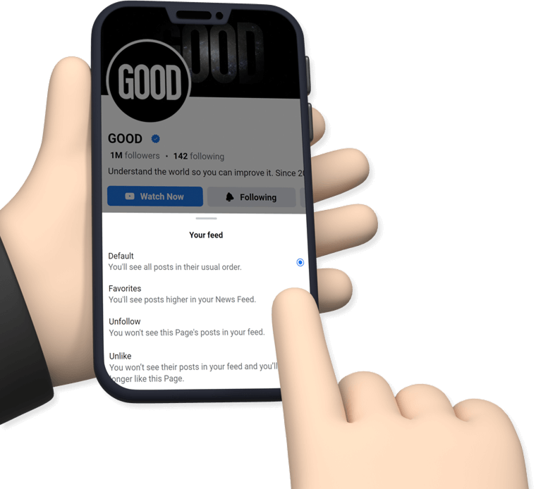
The test presents various shades of blue and green to see which palette a person leans toward. The results show whether someone tends to see more green or blue. As you start the test, the website displays a shade, and you choose whether it’s "Blue" or "Green," or reset if you're unsure.
 Image Source: GOOD Staff
Once the user is done with giving the answers for each question, the website provides a numerical boundary to determine whether the person is more inclined towards green or blue. An example of how to assess the credibility of the test is to observe how people perceive the color turquoise. Those who lean towards the blue boundary will perceive it as blue, and vice versa. The same color, but viewed differently by another person — marvelous, isn’t it?
 Image Source: GOOD Staff
This confusion among similar colors is often visible throughout the globe, per IFL Science. How people view colors and how they were taught to understand tints also plays a role in deciding their color boundary. In a comment, the expert shared that the results of the test are not completely perfect as the method of the test itself can affect the results. He wrote, “It can vary depending on device, external lighting, time-of-day, etc. Also, your responses are stochastic.”
Sharing a plausible theory behind the color theory, a man named Andy Kong suggested, “This happens partially because blue receptors are rare in the eye (4%) and small physical differences between people’s eyes can lead to big perceptual differences.” Mineault also mentioned that he added a feature that allows people to compare their results with those of other people and see whether it’s greener or bluer. Explaining further in a comment, the expert said, “The HTML named color turquoise is at hue 174, which coincidentally is exactly the median boundary between blue and green in this population. If your boundary is higher, you consider turquoise green, if it's lower, you would consider turquoise blue.”
While the color analysis is restricted to the blue and green palettes, it helps people get an idea of what their perception of colors is like and how they differ from others. It was also mentioned that a follow-up is likely to be added to the test where people can check yellow and green and eventually others. People were baffled at the differences in their results. @AdlerMerc18348 said, “This test on hard mode would be pink vs red. Pink is just light red but we've been acculturated to see it as a different color.” @khoomeik wrote, “Woah, did not realize color boundaries could differ this much between people.”
You can follow Patrick Mineault (@patrickmineault) on X for more information on neuroscience.


 Rock deterioration has damaged some of the inscriptions, but they remain visible. Renan Rodrigues Chandu and Pedro Arcanjo José Feitosa, and the Casa Grande boys
 The Serrote do Letreiro site continues to provide rich insights into ancient life.


 Music isn't just good for social bonding.Photo credit: Canva
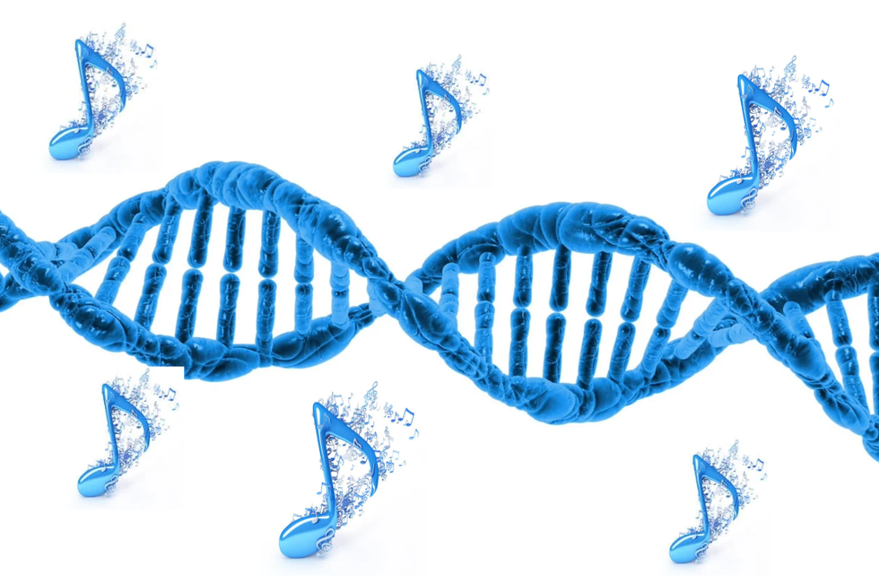 Our genes may influence our love of music more than we realize.Photo credit: Canva
 Great White Sharks GIF by Shark Week

 Blue Ghost Mission 1 - Sunset Panorama GlowPhoto credit: