Early signs point to no. When our government sold us the economic recovery plan last winter, they gave us this chart. The light blue line was supposed to show the future unemployment rate if we didn't pass the recovery plan. The dark blue line was supposed to be the (lower) unemployment rate we'd get if we passed the plan. The red notations (added by economist Greg Mankiw) are the actual unemployment numbers-worse than both scenarios.Macroeconomists will be the first to tell you that macroeconomics is too complicated to be a predictive science. But still, this just has not turned out as planned, at least as far as unemployment goes. So is it better for an administration to make these shaky predictions and risk that they'll be very wrong or to avoid them altogether?P.S. Let's hope this gets better.
Search
Latest Stories
Start your day right!
Get latest updates and insights delivered to your inbox.


We have a small favor to ask of you
Facebook is critical to our success and we could use your help. It will only take a few clicks on your device. But it would mean the world to us.
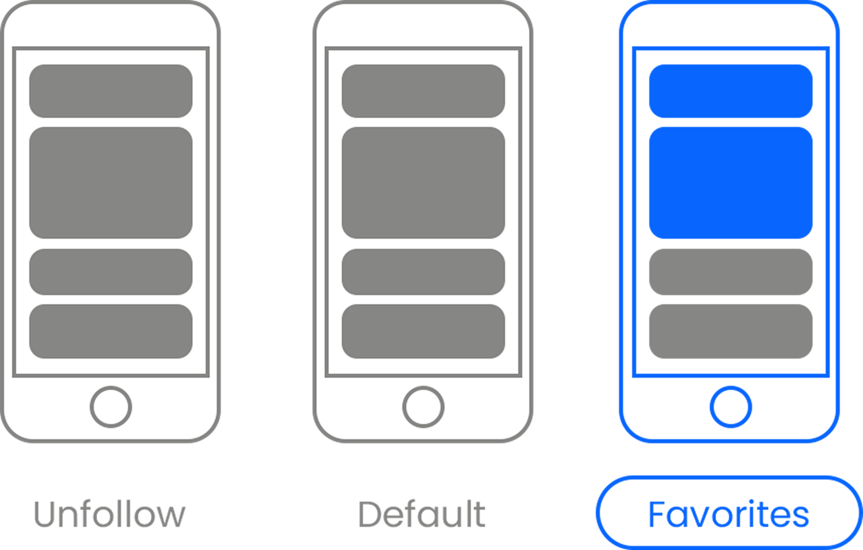
Here’s the link . Once there, hit the Follow button. Hit the Follow button again and choose Favorites. That’s it!

The Latest


Most Popular


Sign Up for
The Daily GOOD!
Get our free newsletter delivered to your inbox