Search
Latest Stories
Start your day right!
Get latest updates and insights delivered to your inbox.
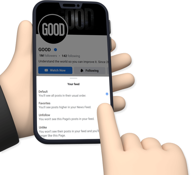


We have a small favor to ask of you
Facebook is critical to our success and we could use your help. It will only take a few clicks on your device. But it would mean the world to us.
Here’s the link . Once there, hit the Follow button. Hit the Follow button again and choose Favorites. That’s it!
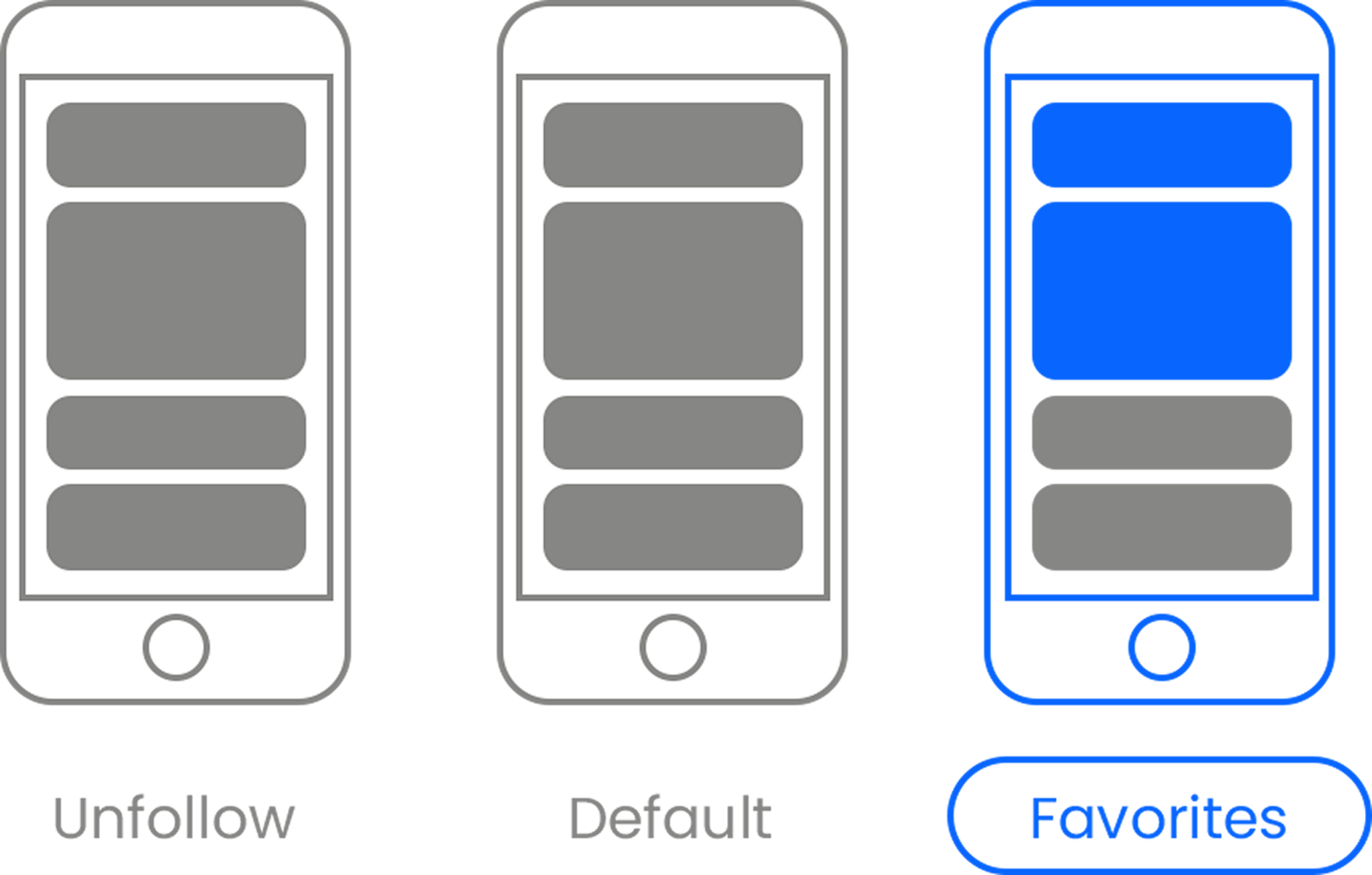
data visualization
Sign Up for
The Daily GOOD!
Get our free newsletter delivered to your inbox
Recent
load more