A map may squeeze the entire Earth into a flat 2D sheet of paper, but it is not always accurate. Condensing a leviathan spherical planet into a flat wallpaper ends up distorting so many elements like continents’ sizes and structures. So, in 2018, some cartographers crafted a new map they called the “Equal Earth projection Map,” which is the most accurate world map created to date. They released their mapmaking study in the International Journal of Geographical Information Science.
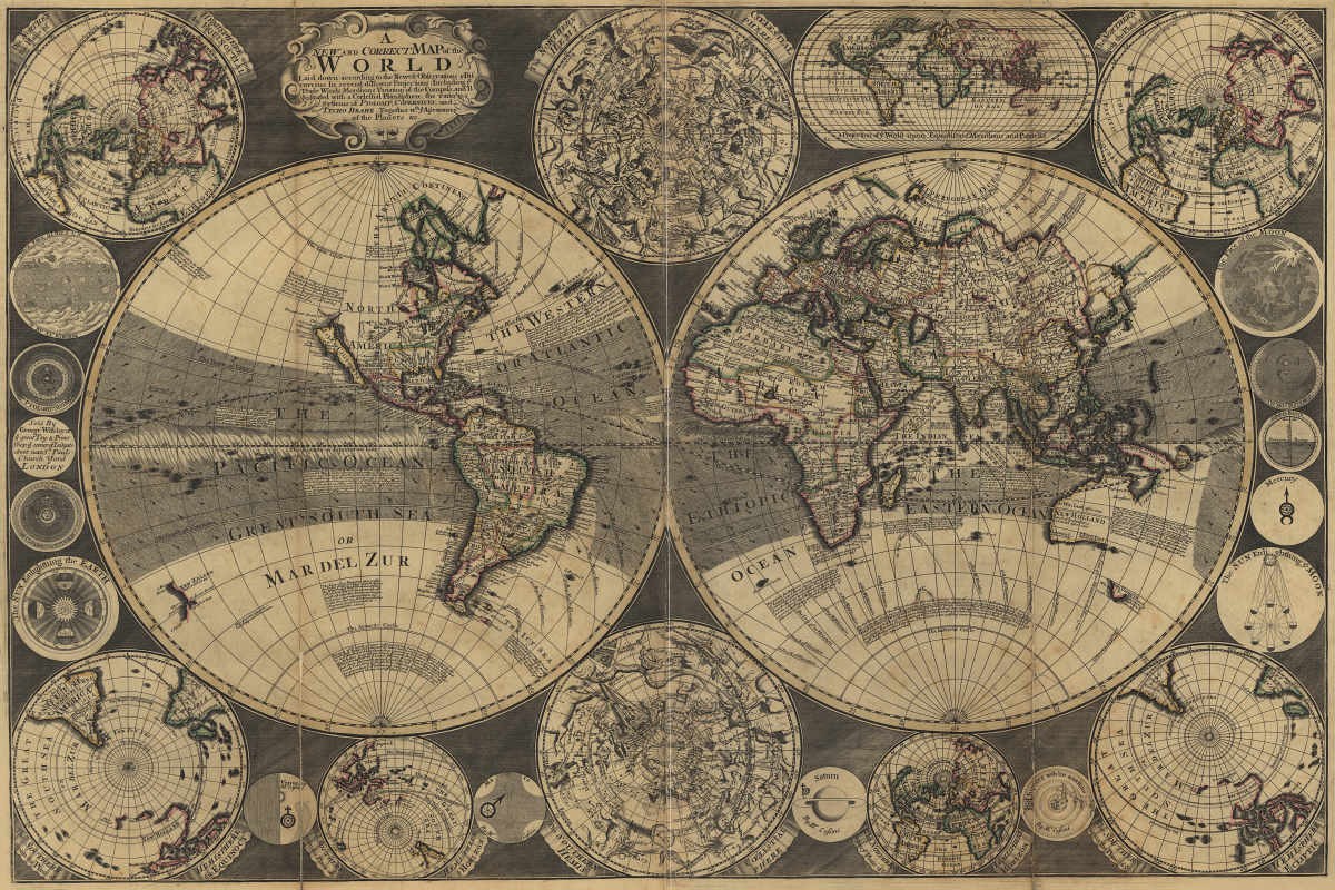
In ancient times, cartographers designed maps with illustrations of sea monsters and gold honey-wine lakes. In 1569, a Flemish geographer and cartographer named Gerardus Mercator designed a map that came to be known as the “Mercator projection map,” per IFL Science. Until the discovery of the Equal Earth map, Mercator was the primary map that was used everywhere. However, the problem with these maps was scientific accuracy.
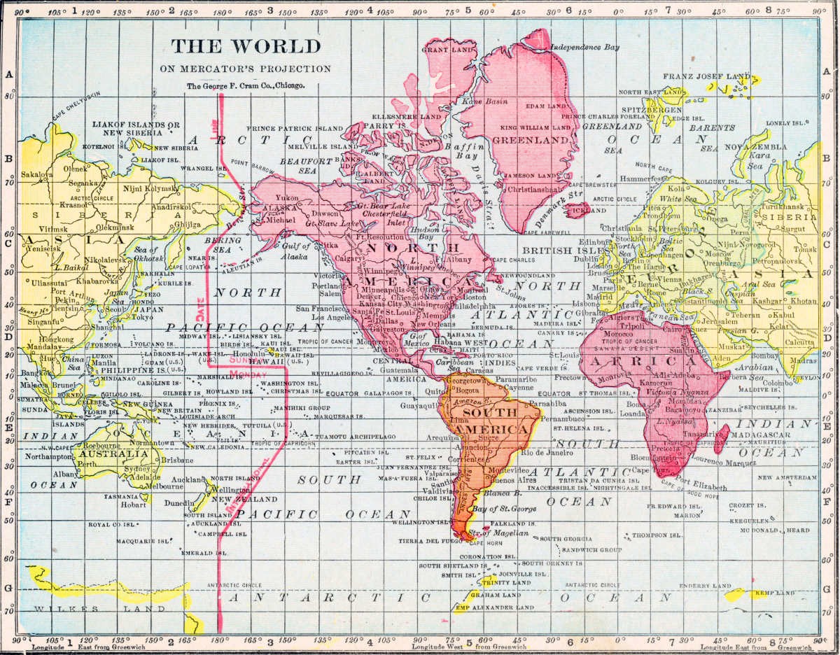
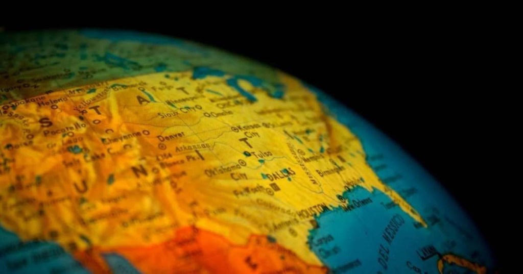
For instance, the Mercator projection map shrinks the size of countries in the Southern Hemisphere and stretches those in the Northern Hemisphere. This creates an issue called the “Greenland problem,” per All That’s Interesting. The consequence is, that this map shows Africa and Greenland as roughly the same size, while in reality, Africa is almost fourteen times bigger than Greenland, per Scientific American.
In addition to the “Greenland problem,” the Mercator map’s system suggests a cultural bias. As the map’s design depicts, European countries appear to be more powerful, as Arno Peters, a German historian also believed. Following Peters’ explanation, in 2017, Boston Public Schools started discarding the Mercator projection to “decolonize the curriculum in public schools” and switched to another map called the “Gall-Peters map.” This map too, came with its own inaccuracies.
So, while the Mercator projection map preserves the angles and shapes of the landmasses, it distorts the size of the landmasses. On the other side, the Gall-Peters projection map preserves the size but distorts the shape of the landmasses. “Every world map is distorted in some respect,” Matthew Edney, a professor at the University of Southern Maine, told Live Science. The new map, the Equal Earth projection map, claims to solve all these problems. It was designed by cartographer Tom Patterson and his colleagues, Bojan Šavrič and Bernhard Jenny.
“We searched for alternative equal-area map projections for world maps, but could not find any that met all our aesthetic criteria. Hence the idea was born to create a new projection that would have more ‘eye appeal’ compared to existing equal-area projections and to give it the catchy name Equal Earth,” the team explained in the paper.
The Equal Earth Map Projection
–https://t.co/Hd436CuWsthttps://t.co/4mxlkCMwM0
–#GIS #spatial #mapping #EqualEarth #EqualEarthProjection #projection #projections #mapprojections #mapprojection #global #worldmapprojection #cartography pic.twitter.com/1ciDNQypuq— Greg Cocks (@gregcocks_kiwi) May 9, 2023
Their design was partly inspired by another map called the “Robinson projection map” from 1963. The Robinson map’s accuracy is known to lie somewhere between the Mercator and the Gall-Peters. It includes the bits and pieces of both the maps that are useful, and discard those that cause distortion. Patterson used this map while upgrading some of its features. “The Equal Earth map projection is inspired by the widely used Robinson projection, but unlike the Robinson projection, it retains the relative size of areas,” he said, per IFL Science.
Apart from a visually appealing design, the team employed complex mathematical equations to achieve the mapmaking objective, as they explained in a YouTube video. The first property they included in their projection was “straight pole lines,” followed by “straight and unequally spaced parallels.” Thereupon, they determined the spacing between the parallel and the equator. Then they used the “least square adjustment method” to model distances and came up with a polynomial equation that solely depended on the powers of parameters. Other properties they included in the map were “uniform distribution of meridians across each parallel” and “equal area condition.” The resulting map preserves both the size and shape of the continents, providing far greater accuracy than any of the previous world maps.


